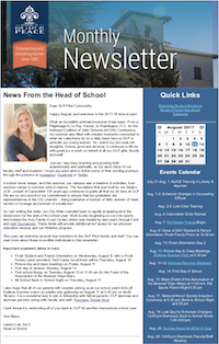
As the communications coordinator at the Academy of Our Lady of Peace (OLP), I was responsible for creating monthly enewsletters for current families and "friends of OLP." We rebranded our enewsletter for the 2017-18 school year in partnership with Ken Soto Design, who also assisted us in rebranding our website and email headers.
New features of this rebranding include:
- A new header with a timeless campus photo, Sans Serif font, blue gradient, our logo with a tag behind it, and an additional tag with text that honors our founding date. The blue gradient is consistent with our magazine's rebranding (fall 2016), and the tags are consistent with our website's rebranding (summer 2017).
- New background colors for the two columns of content. White provides a cleaner look while the new blue is consistent with colors used in our website's rebranding.
- Branding for section and story headers in the main column. Any story with original photos has a header with white text in the same font with a gradient behind it, all of which is placed either above or to the left of the header's photo. Any story or announcement that does not have or need an original photo has a header with an OLP marketing stock photo, which is slightly faded, and dark blue text that is one of two fonts. Finally, any event advertisement has a header with its branded artwork.
- A new footer that uses an OLP branding color, our new font, and new social media icons in another OLP branding color.


